Having worked in packaging for years, I’ve compiled 11 practical printing tips tailored specifically to owners of custom packaging businesses. These cover RGB vs. CMYK, spot colors, bleed, die lines, image resolution, black ink settings, gradients, fine-text printing, the difference between foil stamping and gold ink, specialty finishes, and how paper stock impacts final color.
A polished digital mockup alone does not guarantee a smooth custom packaging run. If you want fewer reworks and avoid costly missteps, you need to keep an eye on the entire production workflow: box structure, print-ready files sent to the factory, color specifications, and consistent mass production.
✅ RGB ≠ CMYK — Color shifts happen easily
RGB is built for phone and computer screens and produces bright, vivid hues. Commercial printing relies on CMYK, and many colors will look darker and more muted once printed. Always convert your files to the correct color space and proof colors before sending artwork to the printer. Don’t wait until production wraps up to discover unwanted color drift.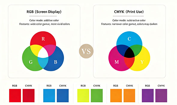
✅ Know the difference between process and spot-color printing
Process (CMYK) printing: Great for most standard packaging. It delivers smooth, varied color gradients at a cost-effective price point.
Spot-color printing: Best for locked brand colors and metallic tones, as it delivers consistent color from batch to batch.
Rule of thumb: Stick with CMYK for regular orders; opt for spot colors when tight color consistency is non-negotiable.
✅ Inadequate bleed causes white edges after trimming
Bleed is the artwork that extends beyond the trim line. The industry standard is 3 mm on all four sides. Keep text, logos, and other critical artwork safely inside the margin so they do not get cut off during finishing.
✅ Die lines are structural guides, not decorative elements
Die lines indicate exactly where the box will be cut, creased, folded, and glued. Always confirm your die-cut template before laying out artwork, so text and graphics do not land on crease lines or get trimmed away. Remember: finalize the box structure first, then build your layout.
✅ Low-resolution images turn noticeably blurry in print
All packaging images should be a minimum of 300 DPI at the actual finished size. Stretching low-resolution assets creates obvious blurriness and pixelation that ruins the final printed look.
✅ Two types of black — choosing the wrong one creates print issues
Solid single black (K100): Ideal for small text and fine lines, delivering crisp, sharp results.
Rich black: Used for large solid black backgrounds to achieve a deeper, fuller black tone.
Quick guide: Use K100 for fine text and thin lines; reserve rich black for large black background areas.
✅ Gradients look seamless on screen but often struggle in print
Gradients that appear perfectly smooth on your monitor can develop banding, streaks, or muddy transitions on press. This risk rises sharply for large gradients or gradients with dramatic shifts between light and dark tones. Always request a press proof for artwork that features critical gradients.
✅ Tiny text and thin lines carry registration risks
Overly small fonts and ultra-fine lines tend to print faint and fuzzy. If multi-color text is slightly misaligned during registration, you will see unwanted color fringing or ghosting. Whenever possible, print small text in a single color — clarity beats overly delicate styling.
✅ Specialty finishes shine when used sparingly, not overdone
Foil stamping creates authentic metallic luster, while spot UV creates eye-catching contrast between matte and glossy surfaces. Many clients assume more finishes equal a higher-end package. In reality, strategic, restrained embellishments create a premium feel. Overloading a design with finishes only raises costs and increases the odds of printing defects.
✅ Foil stamping is not the same as gold ink
Any gold you see in digital mockups or printed with standard ink is only a simulated metallic effect. Foil stamping uses heat and pressure to transfer actual metallic foil onto the paper. Never judge the final foil result based solely on a digital preview.
✅ The same artwork prints differently on different paper stocks
Identical artwork can yield very different colors on white cardboard, coated art paper, specialty stock, or silver card. For example, the same pale green may look fresh and clean on white board but take on a subtle metallic undertone on silver card. Do not rely only on digital renders when quoting orders; always confirm the paper selection upfront.
Every point above addresses problems that commonly lead to reprints, delivery delays, and unexpected losses. That said, you do not need to run through this full checklist for every job, and following these guidelines will not eliminate every possible printing risk. Before any job goes to press, we review each product individually: checking color mode, bleed settings, resolution, black configuration, and paper stock. This cuts down on endless revision cycles, keeps color consistent across production runs, and helps you avoid unnecessary losses.
If you have an upcoming packaging project and are unsure about your artwork or finishing choices, feel free to reach out. We provide free quotations and thorough pre-press file reviews. Request a quote today to get started.