-
E-mail: dulinkpack@gmail.com
-
WhatsApp: +86-19974918753
-
WeChat: DulinkPack


Today, we’re going to talk about the basics of color printing, especially focusing on four-color printing and Pantone colors. These are essential concepts you should understand before moving forward with printing!
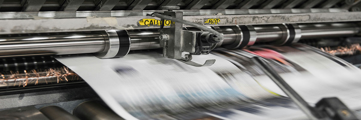
Four-Color Printing: CMYK
First, let’s talk about four-color printing. This method involves using the three primary colors (Cyan, Magenta, Yellow) plus black ink (Black), making a total of four colors mixed together. This printing technique allows you to achieve a variety of shades, lightness, darkness, and gradient effects.
However, if you need higher saturation or more accurate colors, you’ll need to use Pantone colors.
Setting Four-Color Values: Details Matter
To ensure optimal printing results, setting the color values correctly is crucial. Typically, color values should be set in multiples of 5 (i.e., the unit digit should be either 0 or 5), and any values lower than 5 should be rounded down to 0. Since different screens may display colors differently, it’s important to refer to the 【Four-Color Printing Color Chart】 for more accurate results during production.
Choosing Between CMYK and Pantone Colors
The advantage of four-color printing is that it’s more cost-effective and can produce a wide range of colors. However, the color gamut is relatively narrow, and the colors tend to appear darker than those in the RGB color model. In this case, Pantone colors can help you break through this limitation and offer more vibrant and accurate color options.
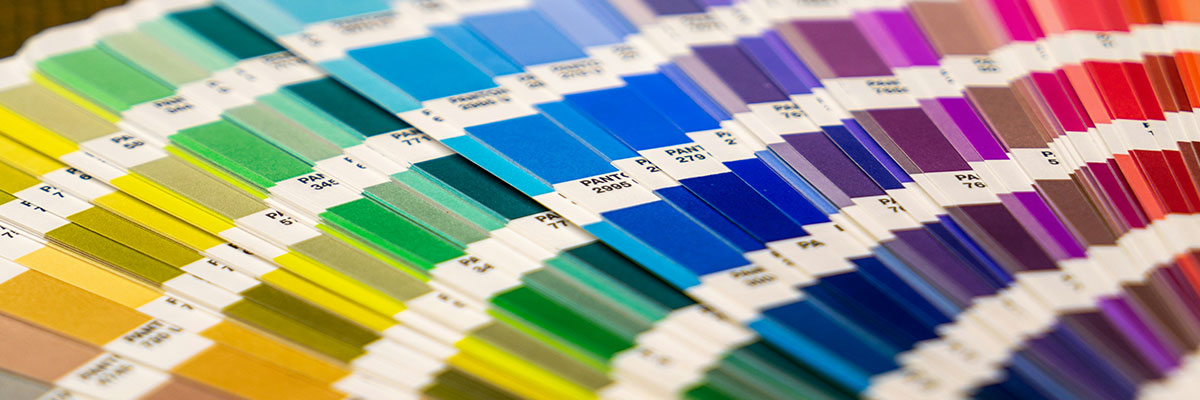
Pantone Colors: The Internationally Recognized Standard
Pantone colors (PANTONE) are internationally recognized color codes, where each code corresponds to a specific color. Using spot colors for printing allows you to accurately reproduce the color specified by the Pantone number. In practice, designers typically use the PANTONE+ Solid Coated color swatch (commonly known as the C card, Coated refers to the glossy paper type) to select colors. However, this method tends to be more expensive than four-color printing.
Using Pantone Colors: Quick and Accurate
When using Pantone colors, you can simply refer to the Pantone color chart, which is both quick and accurate. If you don’t have a physical swatch, you can use software or online resources to reference Pantone colors. However, be aware that color display can vary from screen to screen, so it's best to refer to the 【Pantone Color Swatch】 for final color selection.
Pros and Cons of Pantone Colors: High Saturation vs. Cost
The major advantage of Pantone colors is their high color purity, ease of identification, and controlled consistency. These colors are widely accepted as international standards and often offer high-saturation shades (like bright orange or vibrant green). However, the downside is that Pantone colors can be more expensive, and they do not include pure black.
At Dulink, we offer a wide range of custom packaging products—including corrugated boxes, mailer bags, custom stickers, and tissue wrapping paper —each with unique surface materials and printing needs. Choosing the right color mode can significantly impact the final appearance of your packaging.
For Kraft boxes and mailer bags, which often use recycled or matte surfaces, Pantone (PMS) colors are ideal for achieving precise brand colors, especially if your design includes solid blocks or spot logos.
For stickers and tissue paper, CMYK printing works well for multi-color designs, gradients, or illustrations. However, if your stickers have a specific brand color, using Pantone ensures consistency across batches and materials.
If your packaging uses dark materials (like black or kraft paper), white ink as a base layer may be required before CMYK or Pantone colors are applied, which can affect cost and vibrancy.
When working with us, our design and production team will recommend the best printing method based on your material, budget, and brand requirements, ensuring that your packaging not only looks great but also performs consistently.
If you're curious about how to convert colors from digital formats like RGB to Pantone for accurate printing, check out our in-depth guide:How to Convert RGB to Pantone Colors for Printing. This article walks you through the tools and best practices for ensuring consistent brand colors from screen to print.
Still unsure about all those Pantone codes like TPX, TCX, or C/U? We’ve got you covered with How to Understand Pantone Colors: A Full Breakdown of Pantone Codes. This article explains the meaning behind each Pantone suffix, and how to select the right color swatch based on your material—whether you’re printing on coated paper, textiles, or custom packaging.
That’s all for today’s basic knowledge on color printing! I hope this information helps you in your design and printing processes.